Case 3: Gene Expression + Biological Pathway
Outline:
- Fetch and Load Files
Fetch the demo files and gel script from the following git hub site.
https://github.com/j23414/Mango_Workshop
Open "gel.txt" inside of mango and load in the example microarray data and visualize it.
node(string id, string name, float control, float tr1, float tr2) nt;
link[] lt;
graph(nt,lt) eco_expr=import("eco_expr.tsv","\t");
layout(eco_expr,"cube");
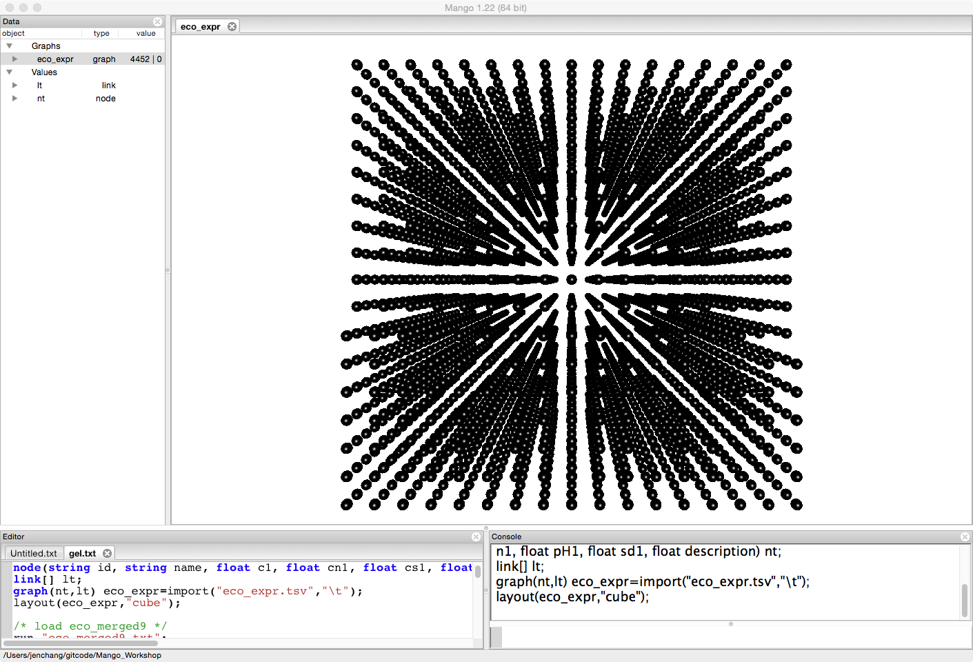
The data was originally collected by Hyejin Cho and Hui-Hsien Chou and is not yet published. therefore we are making available only the control and two treatments for this example.
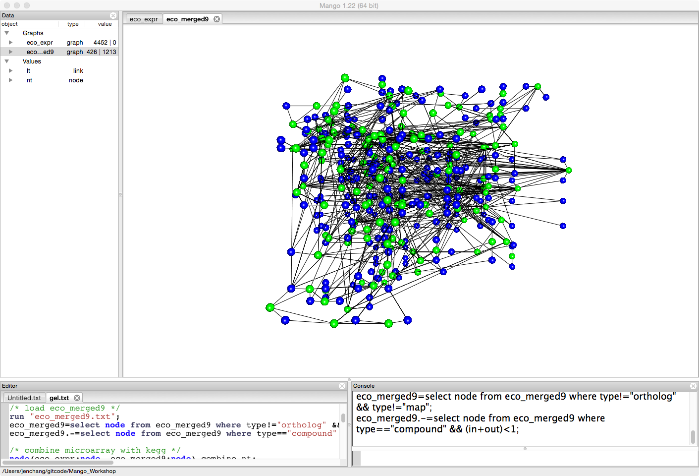
Either load the first 9 pathways in KEGG for e coli (see Fetch Graphs from KEGG) or run the following script.
/* load eco_merged9 */
run "eco_merged9.txt";
eco_merged9=select node from eco_merged9 where type!="ortholog" && type!="map";
eco_merged9.-=select node from eco_merged9 where type=="compound" && (in+out)<1;
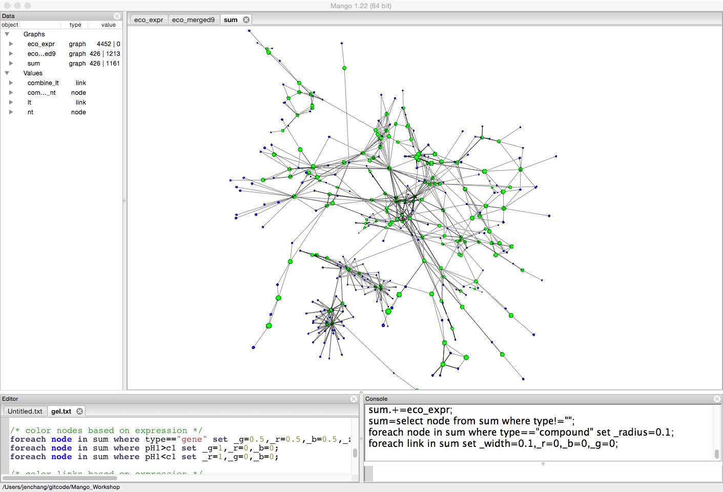
Create a combined network, merging gene expression data with biological pathway data.
link[eco_expr:link, eco_merged9:link] combine_lt;
graph(combine_nt,combine_lt) sum=eco_merged9;
sum.+=eco_expr;
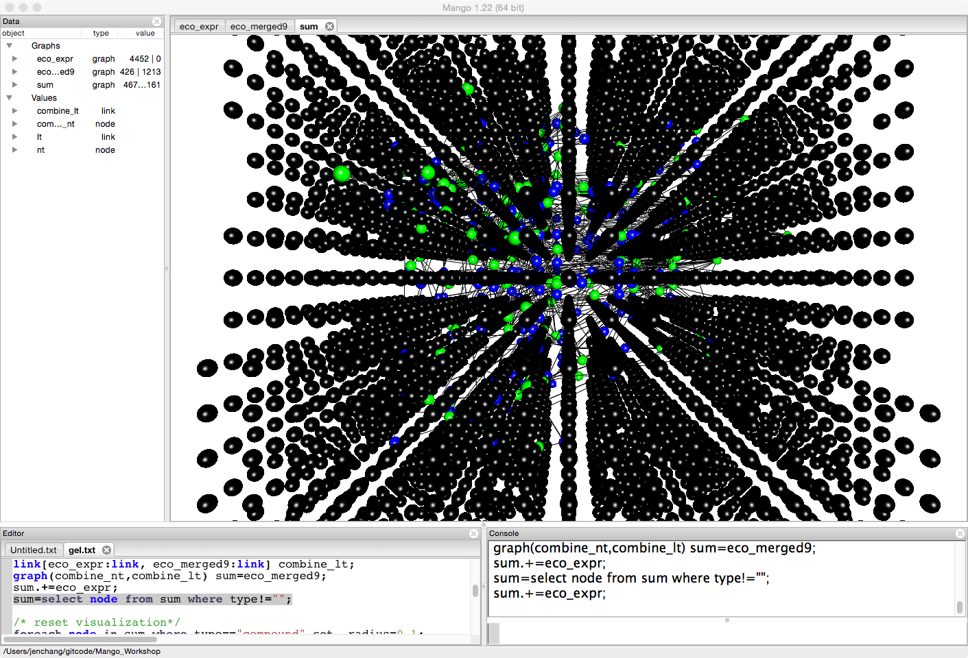
Since we are focused on some pathways (we could load all pathway) for ease and brevity, let's get rid of any of the expression data not involved in these nine pathways.
sum=select node from sum where type!="";
Right click to run force-directed layout and spread out the graph more.
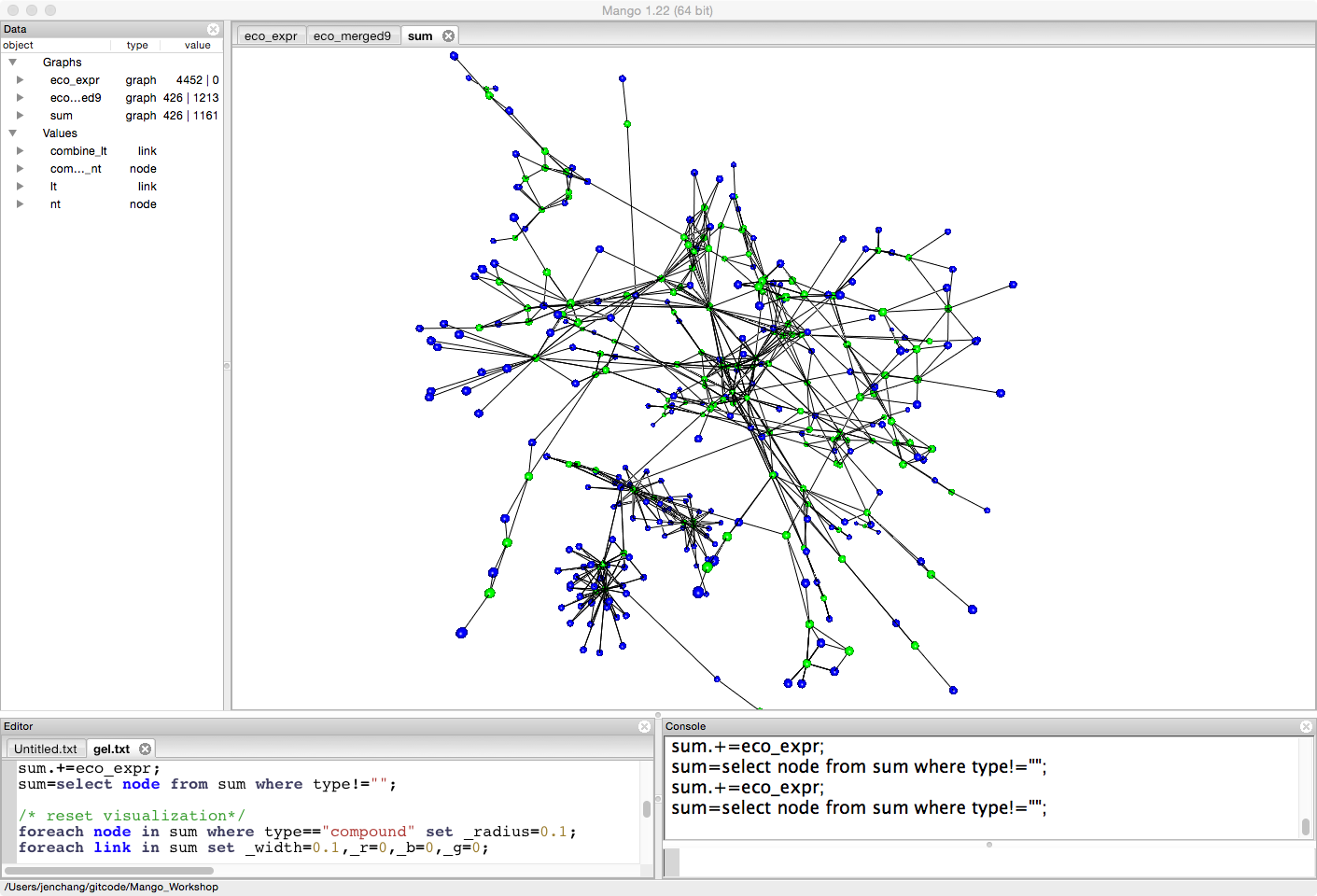
Since we are looking at gene expression, let's minimize the radius of compounds (the blue nodes).
foreach node in sum where type=="compound" set _radius=0.1;
foreach link in sum set _width=0.1,_r=0,_b=0,_g=0;
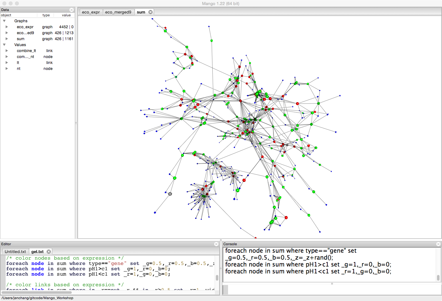
Let's look at the difference between two treatments (pH1, and c1). For the moment it doesn't really matter what the treatments mean. This is just an example to compare expression levels between treatments. Genes that have more expression in pH1 than c1 will be colored green. Genes that have less expression in pH1 than c1 will be colored red.
/* color nodes based on expression */
foreach node in sum where type=="gene" set _g=0.5,_r=0.5,_b=0.5,_z=_z+rand();
foreach node in sum where tr1>control set _g=1,_r=0,_b=0;
foreach node in sum where tr1<control set _r=1,_g=0,_b=0;
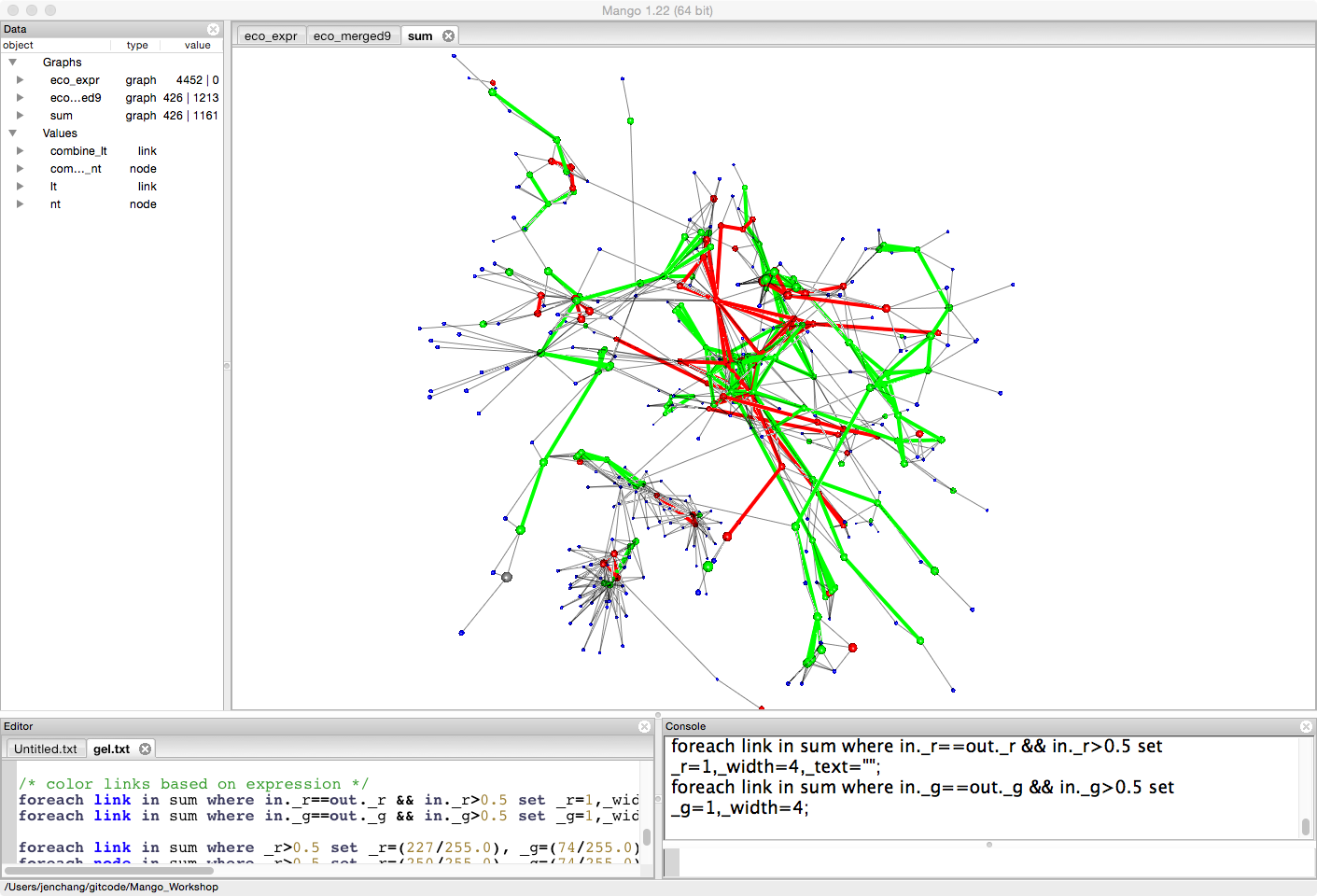
Since we are interested in the pathway, we will color and highlight links that connect two upregulated genes or two downregulated genes.
/* color links based on expression */
foreach link in sum where in._r==out._r && in._r>0.5 set _r=1,_width=4,_text="";
foreach link in sum where in._g==out._g && in._g>0.5 set _g=1,_width=4;
Say we want to see the pathway names. We can either turn on pathway names on highlighted links in this graph or pull them into a separate smaller graph. (threshold)
auto dup=select link from sum where _width>1;
foreach link in dup set _text=substr(pathway,0,4);
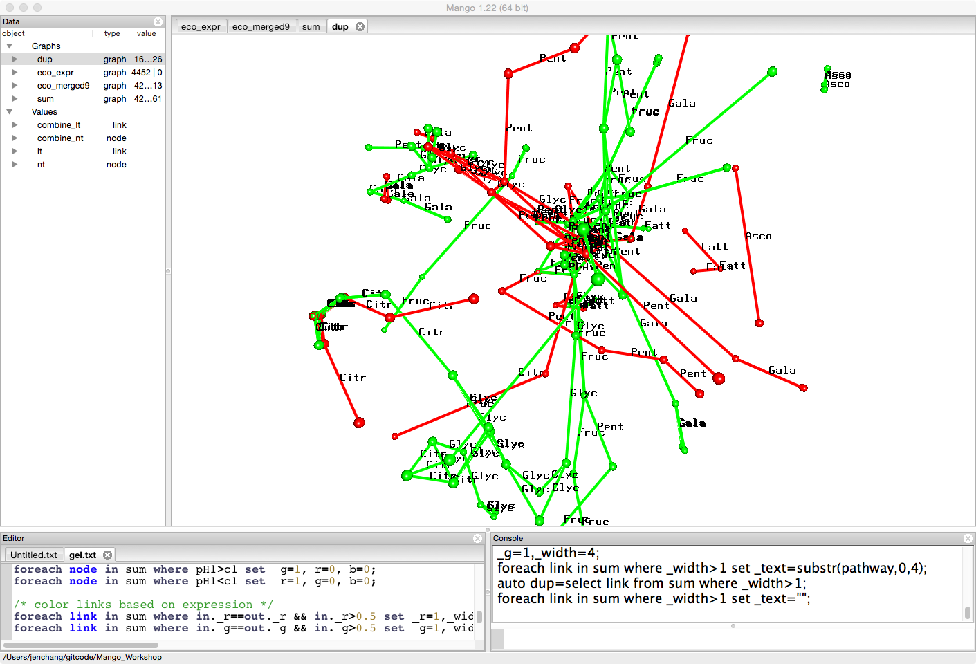
This smaller graph can be exported as a csv and the tabular data loaded into R or any statistical analytic tools to count number of links in certain pathways.
export("diff.csv","csv",dup);